
🔪Design a killer sales page that makes your offer click—and the next step obvious.

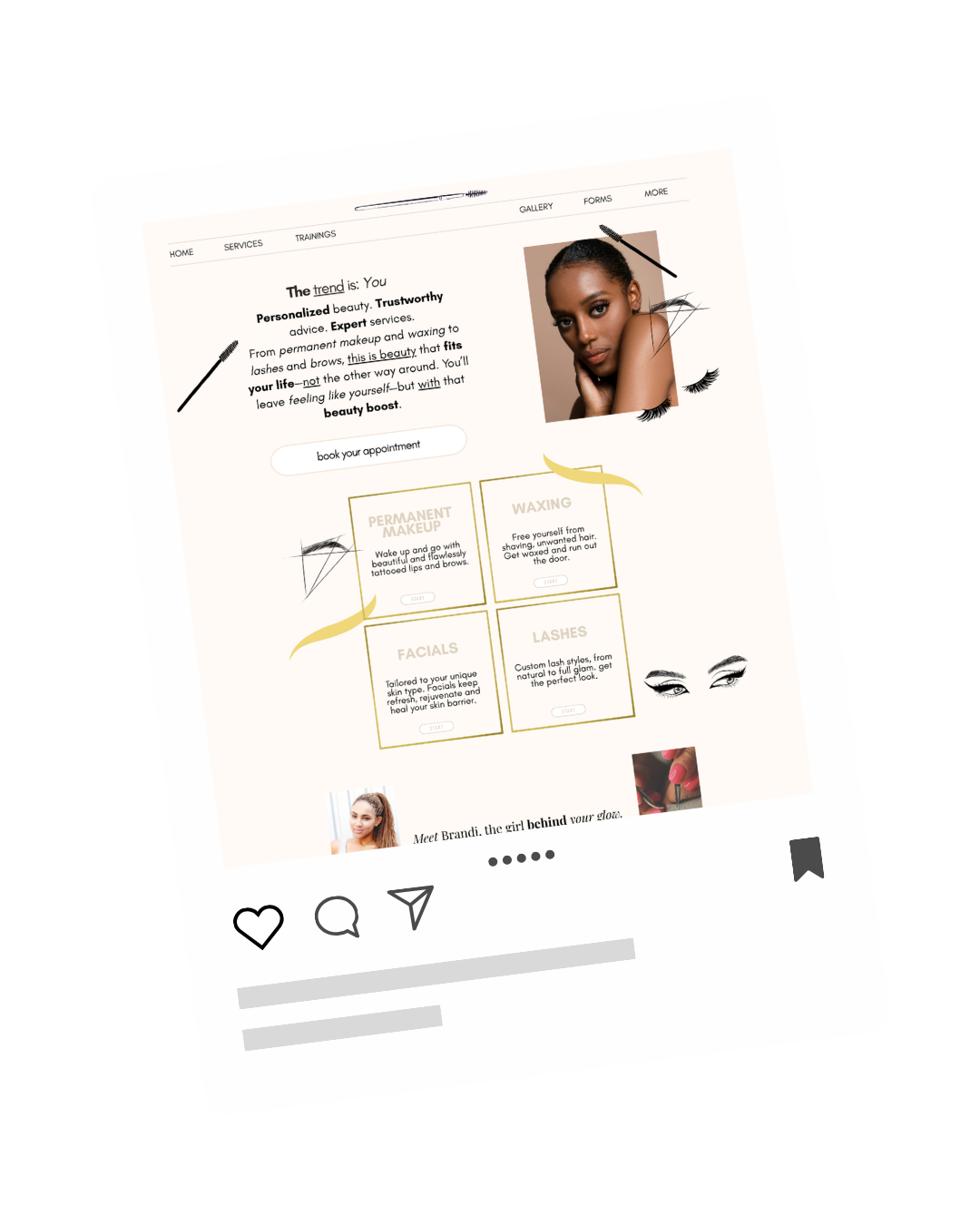
BEFORE
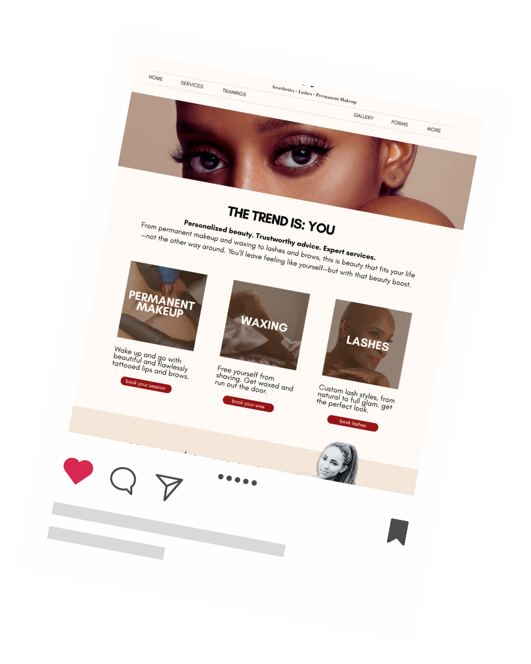
AFTER
confusing &
hard to navigate
clear, scannable & easy to book
Get a simple, section-by-section way to turn your offer into a sales page people can follow without getting lost, overwhelmed, or clicking away.
No big agency budget or design skills needed.
Let’s start with a moment of silence...
To acknowledge everyone who’s nearly lost it
trying to create their sales page.
Because seriously…
Creating any webpage, even if it’s “just one page”—is a lot.
Like… the copy alone?
That takes me out.
And then there’s the platform.
The one you don’t use often enough to remember how anything works…
So every time you open it, it’s like:
wait—how do I add text and margins and resize this again?
Now you’ve got four tutorials open,
and you’re clicking around trying to figure it out… again.
All while thinking, “this is the page.”
The place people land.
The space that people greets people when they click away from social media.
So yeah—there’s pressure.
You want it to look good.
You want it to make sense.
You want someone to arrive there and feel supported, guided—and know: yes, this is for me.
But at some point, you’re adding in text, uploading photos, moving things around, creating a mess and just hoping things will somehow magically click.
After a while
you can’t even tell what you’re looking at anymore.
Sales page salad.
This.
This thing you’re doing.
It’s not working.
You’re ready to hand it off.
The plot twist is: YOU are the designer on call
so you need to push on, figure it out and just get it done.
And “Just get it done,” isn’t really the energy you want for this.
It’s your body of work.
You want to do it justice.
(And never have to make edits again.)
What’s actually happening is:
You’re trying to design a sales page so it looks good.
But THAT doesn’t give you a clear way to decide what goes where and why.
So everything feels like a question.
And no matter how much you tweak it—
it still doesn’t seem good enough and you don’t feel confident sending people to your page.
The thing is: templates only take you so far.
They show you where to put things.
But they don’t tell you:
which photos to choose (and how to place them)
how to use your brand colors together
how to design your text so people can actually read it
So you follow the structure…and still have no idea if it’s right.
And you’re left trying to fix something
you can’t quite see.
Because a sales page isn’t:
words → then add decoration
It’s:
what this section needs to say → how that info is structured → how you show that best visually
If that middle piece isn’t clear,
the whole page feels off.
What’s missing isn’t more effort or another template.
It’s a way to move through your page
and make decisions as you go.
That’s what you haven’t been taught.
And what makes design feel purposeful and easier.
You (yes, you) can
design a killer sales page on your own
without second guessing every move.